For Your Eyes Only:
Tips to my fellow translators for vision preservation, comfort, productivity.
Disclaimer: this article is offered as practical guidance, and does not constitute medical advice.
You are welcome to repost, crosspost, copy, rip, quote: I do not care for copyright when health is at stake.
|  |
Monitor brightness level (the silent killer?)
- Too much brightness can permanently hurt the eye.
Do not underestimate this point, it's crucial to avoid headaches, sleeping problems, and in some cases, early macular degeneration.
- Too little brightness forces the eye and brain to work more to guess-read, recognize letters.
That effort is largely unconscious, so the damages appear too late, near retirement age
("loss of intellectual acumen", a polite way of describing a scarier condition).
This setting is crucial. Your monitor should feel like you're looking at a sheet of white paper, with perhaps 10 to 15% more brightness - not more.
Exercise
- Look at a whitish part of your screen.
- Ask yourself: do I have the impression to stare at a light source?
- If the answer is yes, brightness may be too high.
- Adjust the brightness level.
Give it a go for a day at least, don't judge too fast. We're naturally uncomfortable with changing habits
Tech considerations. Modern monitors have a maximum brightness designed to work in a brightly lit room, for example, an "open space" office with large windows.
In a moderately lit room, a safe brightness level for a monitor should be set at 50-75%. More is not better.
100% brightness in a moderately lit room is visual suicide.
Too much brightness can accelerate or worsen macular degeneration, a condition that is difficult to treat.
Granted, too little brightness can be detrimental too, so finding the correct balance is necessary; however, too much is worse than too little.
Bad habit: not changing brightness level when night arrives, working in a dark office staring at a day-level monitor.
Translators on a deadline (rather, always on a deadline?) are night owls. Owls are cute, blind owls are miserable.
Check whether your monitor can adapt to ambient light (not all do!). Mine can, so
I don't need to adjust brightness between day and night. If yours can't, consider an upgrade.
Keep one or two lights of medium intensity in your office at night. But
- not in direct view;
- avoiding reflection on the screen.
Do not worry for the planet: with the advent of LED, lighting is a really small fraction of the power draw. A few watts.
Heating/AC, or your kettle, or your Tesla, those go by the kilowatts.
What is the optimal zoom factor for my screen?
Ophthalmologists recommend the following standard: from your usual viewing distance,
gradually reduce your zoom factor down to the smallest text you can read, a size where you can barely recognize glyphs.
Do not get too near the screen to perform this.
The recommended zoom factor is three times that strong.
Exercise
- Keep the Control key pressed and use the mouse wheel.
- Reach the smallest size you can barely read, forcing you to squint.
- Note the zoom factor -- it should appear when you roll the mouse wheel.
On my 21-inch monitor right now, sitting ~ 20 inches (~ 50 cm) away, with text that's a default 10 points, the smallest zoom factor
at which I can still read is 40%. Thus, comfortable reading would be achieved at a 3 x 40% = 120% zoom factor.
For some reason, my high-mileage eyes find 110% to be fine. Life is good.
Note: we are dealing with a zoom factor (a ratio expressed in %), not a font size (an absolute value).
The above discussion assumes text with a 10-point font size.
Documents rarely use fonts under 10, or over 12 points, for the document's body. Make the necessary adjustments.
Minimize eye strain
Monitor
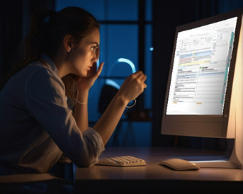
If you work on a laptop, I advise attaching an external monitor and an external keyboard when at home.
Using a bare laptop as workhorse is not a good idea, unless your screen is well over 15 inches. If you don't agree, you're probably still young!
But beware of "more is better" with monitors. A single large monitor is a good option.
Multiple monitors, however, are not necessarily a good option, unless you must keep ancillary information at hand for occasional use.
I emphasized "occasional". Constantly moving eyes between multiple monitors forces focusing all the time - not a good idea.
Having a glossary, or supporting material, on a secondary monitor is fine if you do not need to look at it at every segment you translate.
A good translation tool should run the glossary for you, and bring suggestions right where they belong, on the source segment, where your eyes are.
Keyboard
External keyboards offer dedicated Home, End, PageUp, PageDown keys, which are crucial to text navigation.
We translators navigate text and documents like Magellan navigated the globe.
Not having dedicated navigation keys really hurts productivity, forcing you to use 2-key combinations, or the mouse, all the time.
On laptop keyboards that need a key combination for navigation keys, even touch typists need to look at the keyboard to perform a key combination in order to get to Home, End PageUp, PageDown.
Even if your laptop has dedicated navigation keys, a standard external keyboard is the wise way to go.
Standard keyboards have key spacing and key position that are both, well, standard, and the result of extensive ergonomy research by designers.
Plus, keyboards come really cheap. The right keyboard can help reduce eye strain!
I have 24 years of experience on translation tradeshows, and seen translators coming to my booth with smallish laptops, confessing "That's my only PC!".
In some extreme cases, the keyboard was not even for the target language ("I bought it in the USA because it's cheaper").
They would do acrobatic fingerwork to generate accented letters, their eyes frantically shifting between screen and keyboard. Ooh-Maa-Gaad.
Anyway, I marvel at how resilient the eyes in our species are.
And I can't resist quoting Pierre Teilhard de Chardin: "Voir. On dirait que toute la vie est là."
This brings another topic: keyboard vs mouse.
Having to frequently use the mouse has two drawbacks:
- It hurts productivity: leaving the keyboard, grabbing the mouse to click a button is far slower than using a shortcut.
- With a mouse action, your eyes have to follow that tiny mouse pointer all the way to the click. Eye fatigue.
With a shortcut - none of that.
Long story short: shortcuts not only enhance productivity, they preserve your eyes.
If you settle for a particular CAT tool or software, the first thing is to memorize the shortcuts.
I will be thick and heavy here, repeating myself: memorize.dem.damned.shortcuts.
Every time you use a shortcut, especially with others watching, there's that soft clapping, that silent praise: "How smart you are, dear!"
Think of other self-employed professions: dentists, doctors, lawyers, etc. They spend many years learning their trade.
They spend a lot of money getting set up: an office with a waiting room, hugely expensive equipment, a secretary.
We translators have none of those overheads. A laptop, and off we go.
So not taking the time to learn healthy, productive habits isn't smart.
There is no such thing as "low rates", or rather, those are a fact of life, whining over those is for losers.
Double your productivity. At the same time - and more importantly - safeguard your visual health. I hope my rant was useful, and I apologize if I was a bore.
One thing about shortcuts is that there is a convergence, most programs use very similar shortcuts nowadays, even across different software.
Most of what you learn in one program will be used in another program.
What is the optimal geometry?
Humans have a prey-like, wide field of view (FOV) of almost 180° x 180°. That's for escaping predators and staying on alert.
But humans are blessed with another, narrower FOV: that of a predator. Yes, we're both. We're preys, but we're skilled hunters too.
Our distant ancestors mostly used the unfocused, prey-like, defensive, wide FOV.
They used the predation (narrow, focused, intense) vision mode only a few hours a week when hunting - and mostly males did so.
In today's post-industrial world, that intense mode can be used over 10 hours a day, for all genders.
Obviously, a few adjustments need to be made to keep our sanity.
When translating, we need relentless attention to minute details for long periods of time. We use the predator's FOV: high-intensity, demanding, focused.
Granted, our preys are made of typos, false friends, semantic pitfalls - but they're real. At times, adrenaline runs high.
Our entire body is on alert, with our eyes as the main interface.
- Vertical viewing angle
Scientists agree that when humans read, a straight-ahead to slightly downward line of sight, and a vertical viewing angle of 20-30 degrees, are optimal.
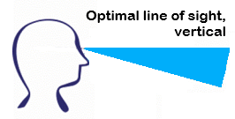

Do not place the monitor too high - you should not have to lift your head to see it.
Adapt the angle to your glasses, if wearing any. If you wear bi-focals, or reading glasses, make sure the center of the screen is slightly (only slightly!) below
an imaginary straight horizontal line coming out of your eyes, where magnification occurs.
Your cervical vertebrae will thank you - after 70.
- Horizontal viewing angle
The angle should feel natural. 60° to 90° is optimal, try to use the narrower 60°.
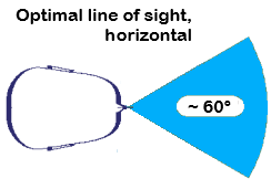
A large monitor is a potential false friend, as it may fill more than 90° of our natural viewing angle, requiring eyeball or head movement to see both ends.
It is acceptable to use a large monitor to place secondary windows with ancillary information,
like a browser, or a supporting document, if those are occasionally (not constantly) needed.
However, for the center of attention, constant eye or head movements should not be necessary.
Your #1 application (your translation tool, or Microsoft Word, or a browser for online applications) should not require constant eye/head movements.
Think of it before maximizing a single application on a large monitor.
- Conversely, on a small screen, do not hesitate to hit the application's "Maximize" button.
Use Alt (or Cmd) +Tabulator to toggle to other applications if necessary, without constantly changing the applications' view modes.
Also, cycling through multiple documents in Ms-Word is done with Ctrl+F6.
- When translating, the text you work on (whether it's a line, a paragraph, a segment, or a sentence) should horizontally fit in your viewing angle
without requiring horizontal scrolling, or head movement, or squinting.
Two simple exercises to alleviate early presbyopia.
You may have seen those exercises all over the place, wondering "Is preventing presbyopia that easy?"
Good news: Yes those exercises actually work.
I learned the following exercise 30 years ago from a top gun of the air force:
- Hold a pencil in front of your eyes at about 30-50 cm. Focus on it for 10 seconds.
- Remove the pencil, focus at the end of the room, or far away, for 10 seconds.
Repeat 10 times. Complicated, uh?
That Top Gun had more advice, such as "eat bilberry/blueberry". As well as a chuckled "Rinse your eye often. See what I mean, chum?".
I still don't get what he meant. Eye drops, probably.
Now I'm going to go insane and link to a youtube clip on a dissertation about... eye health.
Here is a youtube demonstration that goes further.
Associate that with the 4-7-8 breathing, as taught by Santa Claus in person.
Adapting Ms-Word's View/Zoom factor
This part uses Wordfast Classic as an illustration but is also relevant to translators working in Microsoft Word, or any CAT tool.
The zoom factor is important for productivity. It impacts legibility.
A bad zoom factor can dramatically increase errors. So here, comfort means quality.
First, try to have Word occupy sufficient space on your desktop for legibility, without maximizing its window.
In Draft view, adjust the zoom factor to have a comfortable text size.
Ideally, there should be a couple lines of text before (atop) and after (beneath) the segment, for context.
This is easy to achieve on a large monitor, but is difficult, and critical, on small or medium-sized laptops.
Once this is done, make sure that on long sentences, text wraps, instead of disappearing beyond Word's right border.
Microsoft Word has a setting that's so crucial for translators to achieve this, but it's difficult to find.
Word has no less than 4 different places to tweak display (or "view") options:
- The ribbon's "View" tab. It has a "zoom" option that, well, doesn't do what I need, apart from zooming in/out, and a "Page width" that makes sense in ...
"Page" view, which isn't recommended for translation.
- File/Options > "Display". Yep, plenty of settings, you all know them, but not the crucial one I have in mind. Let's keep digging.
- File/Options > "Advanced" > "Display". Are we there? Nope. And you're probably familiar with that one too.
- File/Options > "Advanced" > "Show document content". There we go. Make sure you check Show text wrapped within the document window.
That one is crucial when using the "Draft" display mode, otherwise, the display can go crazy with some documents. I explain that further below.
Wordfast Classic users: Note there is a setting under Setup / View to make sure that text wraps.
Check that option, even if you don't check Start translation in Draft mode.
With tables or textboxes, and other objects, these settings are important.
Here are two examples of bad zoom factors (too strong) that result in constant horizontal scrolling and jitter:
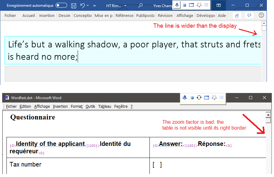
Here is the correct zoom factor to avoid horizontal scrolling. Ms-Word's File/Options > Advanced > Show document content is checked:
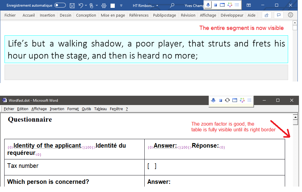
Notes about the two examples above:
- Ms-Word's huge ribbon is shrunk. The shortcut is Ctrl+F1.
When translating on a laptop's small screen, you can minimize that ribbon, and bring it back when needed (Ctrl+F1 is a toggle).
When you select some text, essential icons and features hover over the selection anyway.
- The zoom factor is closely related to window width.
In the first example, widening the window would also solve the issue.
But it would be impossible on a small monitor, so zoom factor is crucial on laptops.
Uncluttering Ms-Word from rarely used accessories
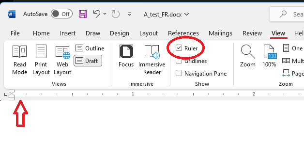
Rulers. For us translators, rulers are rarely necessary. Rulers are for authors, who also rarely use them. On a laptop, they consume precious visual real estate.
Turn them off unless you have a good reason to keep them. Use the ribbon's "View" tab.
Status bar. The status bar, if visible, is at the bottom of the document window.
Keep it visible: WFC occasionally uses it for messages.
Side panes, anchored or floating. Ms-Word may open various panes, such as the search pane, the "Editor", or spell-check pane, a floating or fixed style pane, etc.
Only keep them opened on really large monitors. On a laptop, those must be closed after use with their little "Close" button.
The following section concerns Wordfast Classic users only.
For others, thank you for your attention and take care of your beautiful eyes!
WFC shortcuts
WFC shortcuts are better than the mouse - at all times.
Memorizing essential shortcuts is essential to productivity - unless you're paid by the hour.
See this chapter for a complete list of shortcuts.
The arch-essential shortcuts are:
Alt+Enter
Alt+Down | Start translation / Next segment |
| Alt+Up | Previous segment |
| Alt+End | Close segment / End translation |
Alt+S
| Copy source Mac: Ctrl+S |
| Alt+Delete | Restore (un-segment) a segment |
| Ctrl+Alt+X | Clear the target segment (delete target text) |
Those are shortcuts you cannot afford to ignore.
If you find that you frequently use the mouse for a certain type of action, learn the associated shortcut.
Ms-Word and Wordfast Classic have shortcuts for most actions.
Want to be convinced?
Open two (or more) documents in Ms-Word, play with Ctrl+F6.
Need more convincing? On Windows, press Alt+PrintScreen (little PrnScrn key, top right of the keyboard, the Mac has another technique).
In an email, press Ctrl+V, (Command+V on a Mac). You've included a screenshot in an email in seconds rather than minutes.
Now you can give ATA presentations on productivity.
Setting up Ms-Word's View setting for better eye health, less brain drain, more focus.
Ms-Word has a "View" tab in the ribbon that offers, among others, two fundamental modes:
"Print" (aka "Page", or WYSIWYG mode), and "Draft" (aka "Normal") view.
Draft is the recommended setting when using Ms-Word as a translation tool, which is the case with Wordfast Classic.
If layout and the final look are important, and they usually are, temporarily shift to Page/WYSIWYG view during proofreading.
"Draft" view is best for translation, focusing on meaning. Rare exceptions arise when form is an integral part of meaning.
It is still possible to use the WYSIWYG "Page" view at translation time for short documents (less than ~20 pages) that do not have a rich or complex layout.
WYSIWYG "Page" view generates frequent flicker, due to Ms-Word redrawing the page as you type.
On large or complex documents, constant flicker not only hurts the eyes, it also seriously hampers productivity.
This is why the "Print" or "Page" mode should be left to the proofreading stage.
Bottom line: translation is not authoring, "Page", or WYSIWYG view look beautiful, as false friends do.
Draft view is rock stable, easily zoomed to fit the screen, scrolls smoothly, wastes less space. All of that contributes to better legibility and focus.
In large and complex documents, Page view combined with spellchecking can exhaust Ms-Word's resources, leading to catastrophic failures.
Wordfast Classic translation on small screens
Rambling translators, digital nomads, have to deal with really small screens.
WFC tries to accommodate even the smallest devices.
There is a dedicated option under Setup > View for small laptop screens,
which keeps segments down to a minimalist view mode without much sacrifice on the feature set.
Use this mode in combination with a shrunk Word ribbon (Ctrl+F1), no rulers, a draft view mode,
a proper zoom factor, and you're good to go!
Note: there are options under Setup > View to use lighter shades for an opened segment, or no shades at all.
I've done decades of translation on blurry 13-inch passive-matrix displays, last century, and this century.
You should be fine with a few precautions.
I can still (proof)read a document from a foot away and spot it's typos. Pun intended.
A tip for night owls: when the chin hits the spacebar, time to go to bed.
That may also come in handy in strong sunshine, poolside translation,
space tourism, or cast away on a desert island.
Two setup examples
Laptop with a "very small" LCD screen (11-inch), Ms-Word 2019, shrunk ribbon, no rulers, Draft view,
Minimalist segment enabled under Setup > View,
toolbar set as Mini:
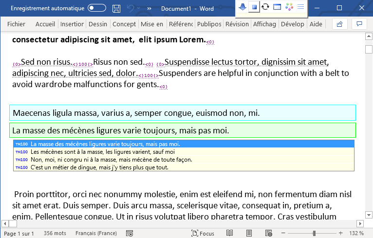
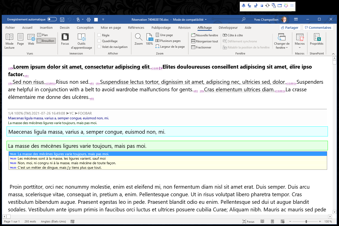
Fragment from a large monitor (21-inch; other applications running on the same monitor), the mighty Ms-Word 2019 with deployed ribbon,
complete segment with the TM's detail above it, AutoSuggest underneath, document context above and below - the whole shebang:
Credits
All trademarks noted™ are the property of their respective owners.
Ms-Word, Excel, Access, PowerPoint are trademarks of Microsoft Corp.
Thousands of anonymous translators who shared their experiences.